Show the sizzle
Tuesday October 23, 2012
To effectively market real estate online, nothing trumps the impact of compelling visual information. Yep, it seems that good photographs, floor plans or architectural renderings even surpass the value offered by detailed descriptive information. Buyers will "read" the visuals before progressing to the facts and measurements. In simple terms, your images may be the only thing a potential investor looks at. If they don't like what they see, the likelihood of reading the rest drops through the floor.
Through pattern analyses the brain subconsciously categorises millions of pieces of information every minute. And, when it comes to marketing, subconscious opinion kicks the pants off rational thought any day of the week. Thanks to relentless daily bombardment, consumers have been conditioned to resist verbal and written messages, but our subconscious is not bound by the narrow-meshed grid of intellectual analyses.
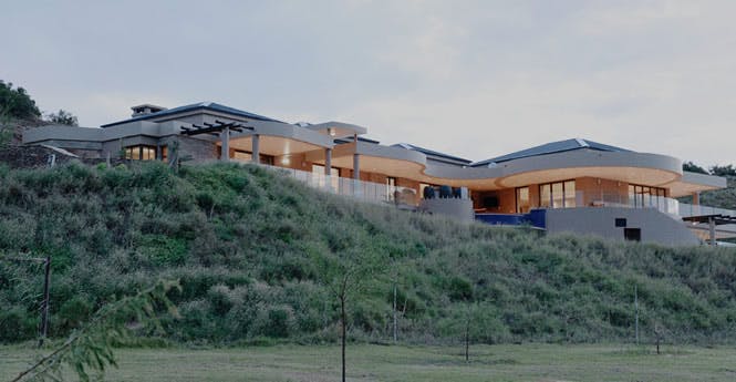
Have a look at the two images below. The first resembles typical real estate photography, whilst the second shows how good photographic technique and technology can be leveraged to yield a far more compelling end product.


What do you need to keep in mind when creating images that best showcase your development? Considering these pointers would be a good start:
- Whether you are selling an eco-estate or 50m2 apartments with no view, ensure that what you show has been professional produced and presents your product in the best possible light.
- Never over-inflate your product. You do not want a disappointed client who feels that they were misled, or that the images misrepresented the home they were interested in. Show the sizzle, but keep it real.
- High quality images attract buyers, but the converse is also true, says Rosalind Clarke, a senior sales associate with the Corcoran Group : “If things look shoddy or unprofessional, not only are buyers going to find the property unappealing, they’re going to associate you with being shoddy and unprofessional.”
- If you do not have good visuals to show, rather show nothing at all.
- When selling individual, residential homes there may be some room to argue that the cost of commissioning a professional to do the photography is proportionately too big a slice of the selling agents' commission. This (already thin) argument, of course, does not hold for developments, where one set of images can be used to market multiple units. The marketing benefits far outweigh the investment. In fact, creating high impact photographs, renderings and floor plans has become the indispensable bedrock of any promotional campaign.
- Lastly, when commissioning photography, do not assume that a high-end digital camera = bespoke images. You require a niche architectural/real estate photographer, as opposed to someone who "specialises" in weddings, maternity, wildlife, landscapes "and architecture". Review their portfolio, ask for examples, and base your decision upon the tangible quality of their work.
And there you have it, a good arrow to put in your marketing quiver. Next week we will delve a little deeper into mapping, and why spatial context makes the property world go round.
Happy selling!